Create Contrast and Mood with the Right Color Temperature

Create Contrast and Mood with the Right Color Temperature
Light in a room is much more than a practical necessity. It shapes the atmosphere, influences how we feel, and changes the way colors, furniture, and materials appear. One of the most important aspects of lighting design is color temperature—the warmth or coolness of the light. With the right color temperature, you can create contrast, balance, and mood throughout your home, whether you want a cozy retreat, a productive workspace, or a bright, energizing environment.
What Is Color Temperature?
Color temperature is measured in kelvin (K) and describes the tone of the light. Lower numbers mean warmer, more golden light, while higher numbers produce cooler, bluer tones.
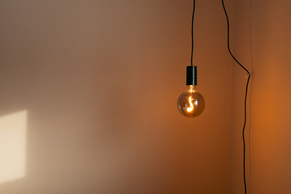
- 2700–3000 K: Warm, inviting light—similar to traditional incandescent bulbs.
- 3500–4000 K: Neutral white light—great for kitchens, bathrooms, and work areas.
- 5000–6500 K: Cool, daylight-like light—ideal for offices, garages, or craft rooms.
Understanding this scale makes it easier to choose lighting that fits each room’s purpose and mood.
Warm Light for Comfort and Relaxation
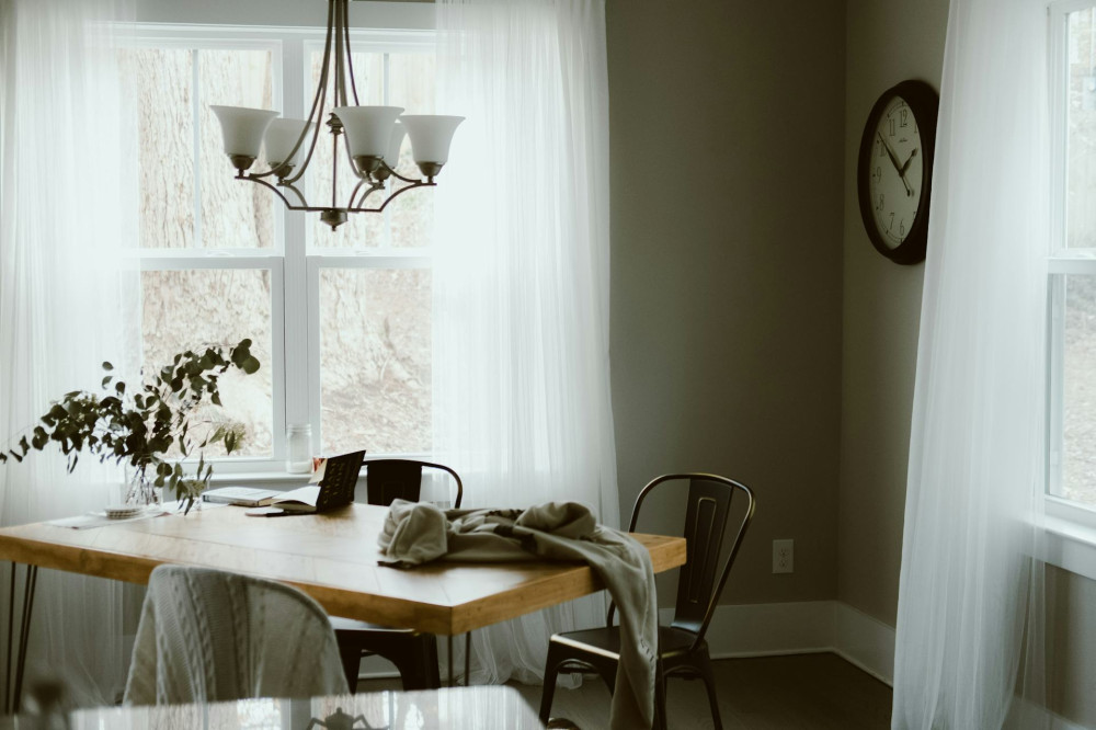
In living rooms, bedrooms, and dining areas, most people prefer a calm, welcoming glow. Warm color temperatures work best here. They enhance wood tones, fabrics, and warm colors, creating a sense of comfort and relaxation.
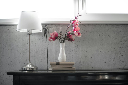
Try layering multiple light sources—such as a ceiling fixture and table lamps—all using bulbs around 2700 K. This creates a consistent, soothing look. Dimmable bulbs are also a great option, allowing you to adjust the brightness and mood depending on the time of day or activity.
Neutral Light for Everyday Function
In kitchens, bathrooms, and entryways, you need neutral white light that shows colors accurately and makes it easy to see details. A range of 3500–4000 K is often ideal. It provides clarity without feeling too harsh or too yellow.
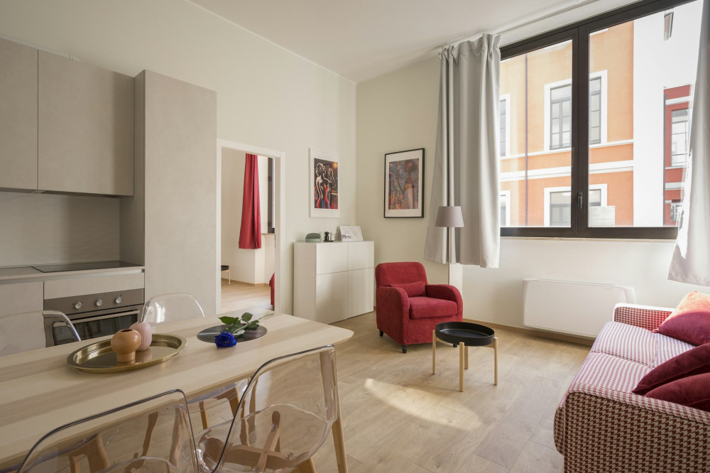
If you have open-concept spaces, you can use slightly warmer light in the living area and cooler light in the kitchen to create a natural transition between relaxation and activity zones. This subtle contrast adds both function and visual interest.
Cool Light for Focus and Energy
Cool, bright light with a higher color temperature (5000 K and above) mimics daylight and helps boost concentration and alertness. It’s perfect for home offices, workshops, or hobby spaces. This type of lighting can help reduce eye strain and fatigue, especially during darker winter months when natural light is limited.
However, use cool light thoughtfully—too much of it in living areas can feel sterile or uncomfortable. Consider mixing it with warmer light sources to maintain balance and warmth.
Using Contrast as a Design Tool
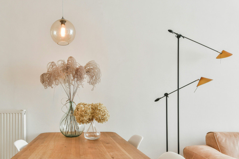
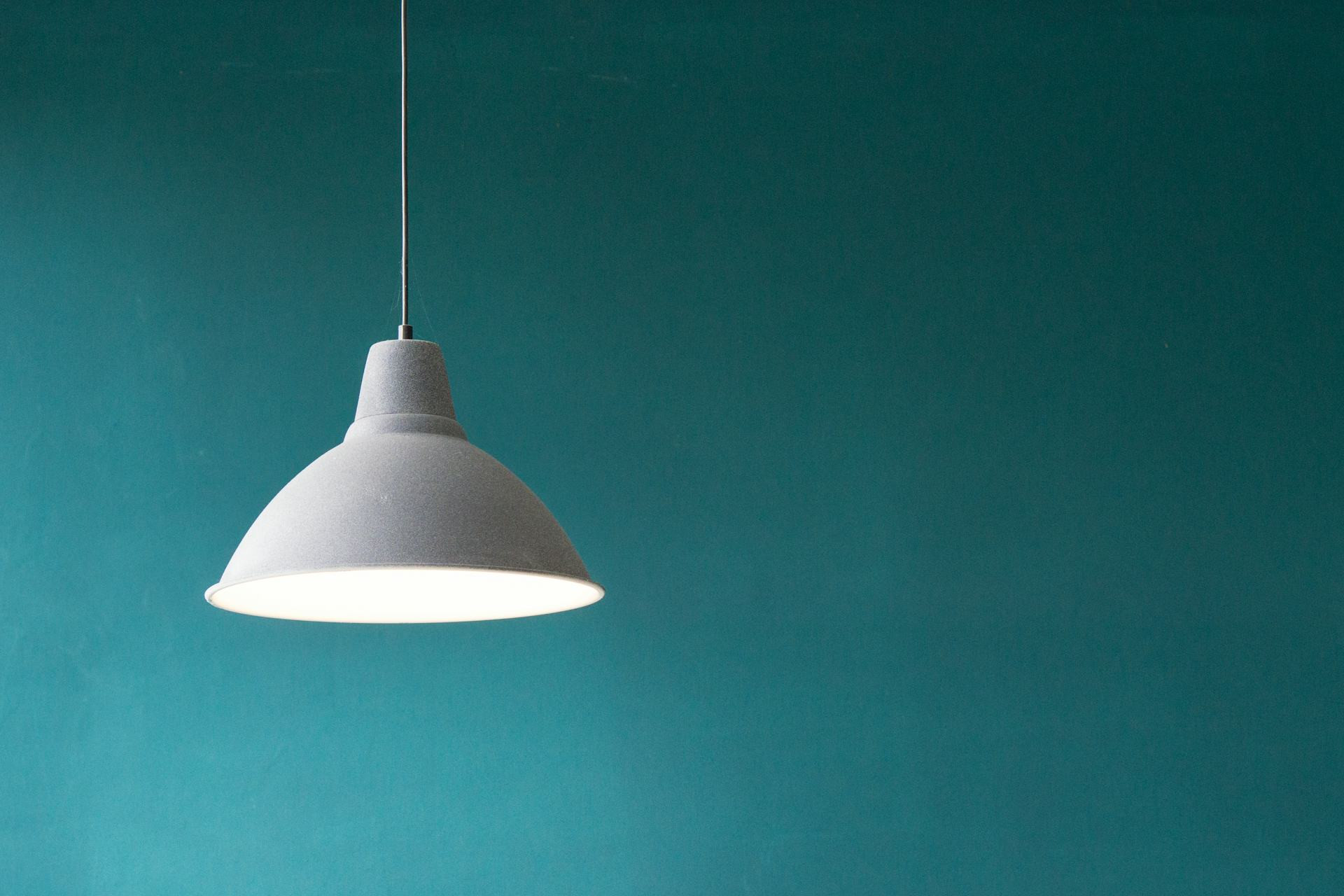
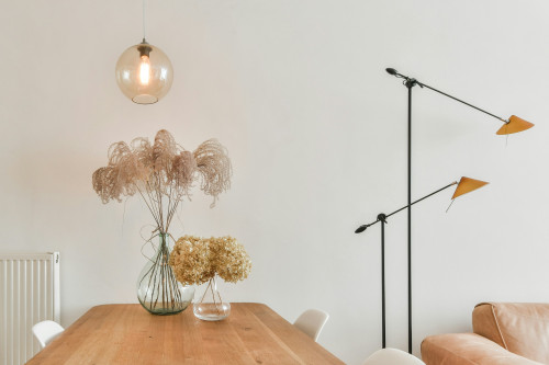
Color temperature isn’t just functional—it’s also a powerful design element. By combining warm and cool light, you can highlight architectural features or define different zones within a space. For example, a warm pendant light over the dining table can contrast beautifully with cooler task lighting in the kitchen, visually separating the two areas while keeping the space cohesive.
In modern interiors, the interplay between warm and cool tones adds depth and dimension, especially in minimalist spaces where lighting becomes a key part of the design.
Choose Bulbs with Good Color Rendering
Beyond color temperature, pay attention to the Color Rendering Index (CRI), which measures how accurately a light source reveals colors. A CRI of 80 or higher is generally good for most home settings, but for areas like bathrooms or dressing rooms—where you want to see true skin tones and fabric colors—look for bulbs with a CRI of 90 or above.
High-CRI lighting ensures that colors appear natural and vibrant, avoiding the dull or grayish cast that some low-quality LEDs can produce.
Læs også:

Layer Your Lighting
The best lighting setups combine different types of light to create depth and flexibility:
- Ambient lighting – general illumination for the whole room.
- Task lighting – focused light for reading, cooking, or working.
- Accent or mood lighting – softer light that adds warmth and atmosphere.
By varying color temperature and brightness across these layers, you can design a home that feels both functional and inviting—and that adapts to your daily rhythm.
Light That Fits Your Lifestyle
There’s no single “correct” color temperature for every home. The key is finding the combination that supports your lifestyle and personal style. Experiment with different tones and placements—small adjustments can make a big difference in how a room feels.
Once you start noticing how color temperature shapes mood and contrast, you’ll have a powerful tool for transforming your home—using light as your most versatile design element.
Læs også: