Colors That Work in Both Daylight and Artificial Light

Colors That Work in Both Daylight and Artificial Light
When choosing colors for your home, it’s not just about personal taste or style—it’s also about light. A shade that looks calm and balanced in natural daylight can appear completely different under the warm glow of your lamps at night. Understanding how colors react to different light sources helps you create spaces that feel comfortable and cohesive all day long.
How Light Changes the Way We See Color
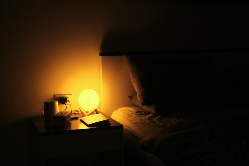
Daylight is generally neutral but shifts throughout the day—from cool, bluish tones in the morning to warmer, golden hues in the evening. Artificial light, on the other hand, depends on the type of bulb you use. LED, halogen, and incandescent bulbs each have their own color temperature, which affects how paint colors appear.
- Cool light (4000–6000 kelvin) enhances blues and grays but can make warm tones look washed out.
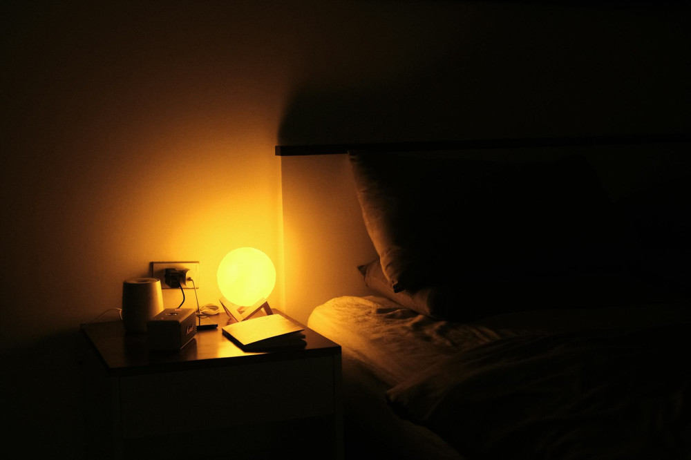
- Warm light (2700–3000 kelvin) creates a cozy atmosphere but can make cooler colors appear slightly yellow.
- Neutral light (3500–4000 kelvin) sits in the middle and is often the most versatile choice for spaces where you want colors to look natural.
Whenever you’re testing paint colors, view them in both daylight and artificial light—and ideally with the same type of bulbs you plan to use in the room.
Colors That Hold Up in Any Light
Some colors are naturally balanced and maintain their character no matter the lighting. These shades have undertones that are neither too warm nor too cool, making them reliable choices for most interiors.
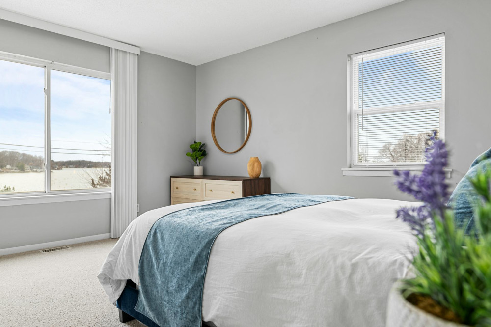
- Soft gray – A neutral gray with a hint of warmth works beautifully in both daylight and lamplight. It’s calming and pairs well with most materials.
- Muted green – A gentle green with gray undertones changes very little between lighting conditions and brings a natural, soothing feel.
- Warm beige – A sandy beige reflects light softly and feels inviting without turning yellow.
- Light terracotta – Adds warmth and depth without feeling heavy in bright daylight.
- Blue-gray – A sophisticated tone that subtly shifts with the light but remains balanced from morning to night.
These colors are especially effective in living rooms, bedrooms, and kitchens—spaces where you spend time throughout the day and evening.
Test Before You Commit
Even the best color sample on a screen can be misleading. Always paint a test patch on your wall and observe it at different times of day. Notice how it looks in bright midday sun versus under your evening lighting.
Try painting samples on multiple walls, especially if they face different directions. North-facing rooms tend to have cooler light, while south-facing rooms receive warmer light. The same color can look completely different depending on the room’s orientation.
Læs også:
Make Lighting Part of the Design
Color and light are inseparable. To make your colors shine, plan your lighting from the start. Combine different types of light for a layered effect:
- Overhead lighting for general illumination.
- Task lighting for focused areas like kitchen counters or desks.
- Accent or ambient lighting from table and wall lamps to add warmth and depth.
Choose bulbs with a high Color Rendering Index (CRI)—ideally 90 or above—so colors appear as true to life as possible. This makes a noticeable difference, especially in rooms with dim or indirect lighting.
Balance With Materials and Textures
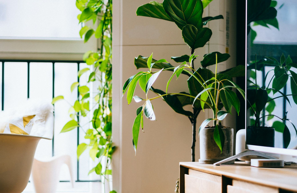
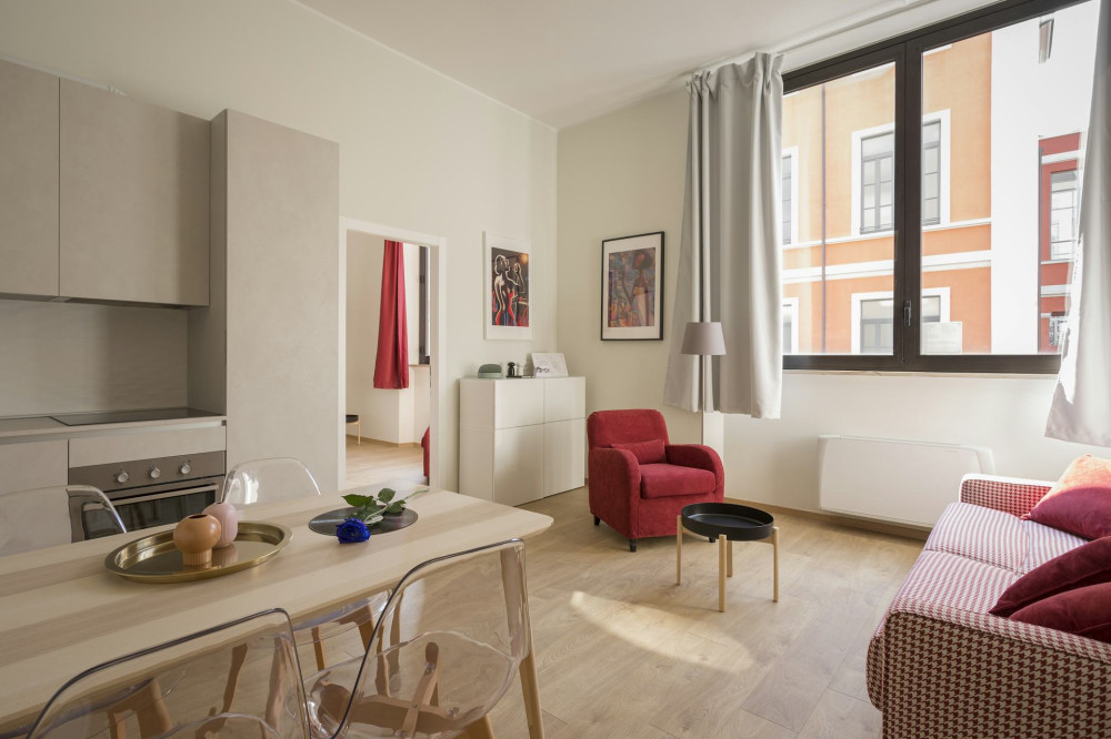
Colors don’t exist in isolation—they interact with everything around them. Wood, metal, textiles, and plants all influence how a color feels. A room with lots of cool surfaces like glass and steel benefits from warmer tones and soft fabrics, while a space filled with wood and warm hues can be balanced with cooler shades.
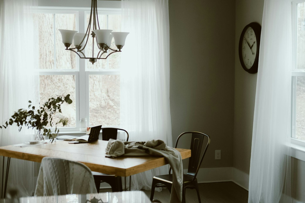
Pay attention to how curtains, rugs, and furniture reflect or absorb light. Light fabrics can diffuse daylight gently, while darker textiles absorb it and create a more intimate atmosphere.
A Home That Feels Right, Day and Night
When color and light work together, your home feels harmonious from sunrise to bedtime. It’s not about finding one “perfect” color—it’s about creating balance between tone, light, and mood. With a little planning, you can choose colors that look beautiful in both natural and artificial light, making your home feel just right at any hour.
Læs også: